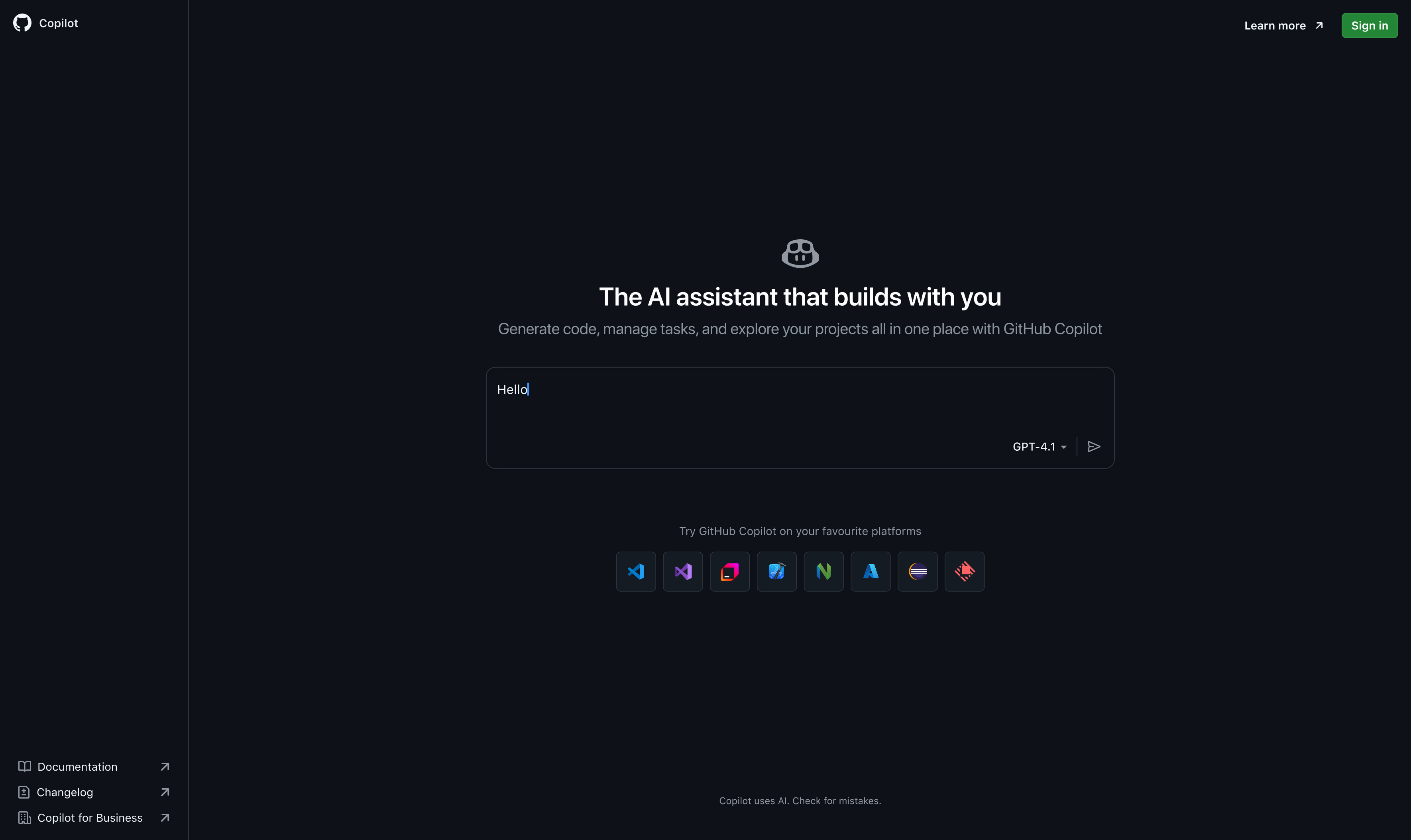
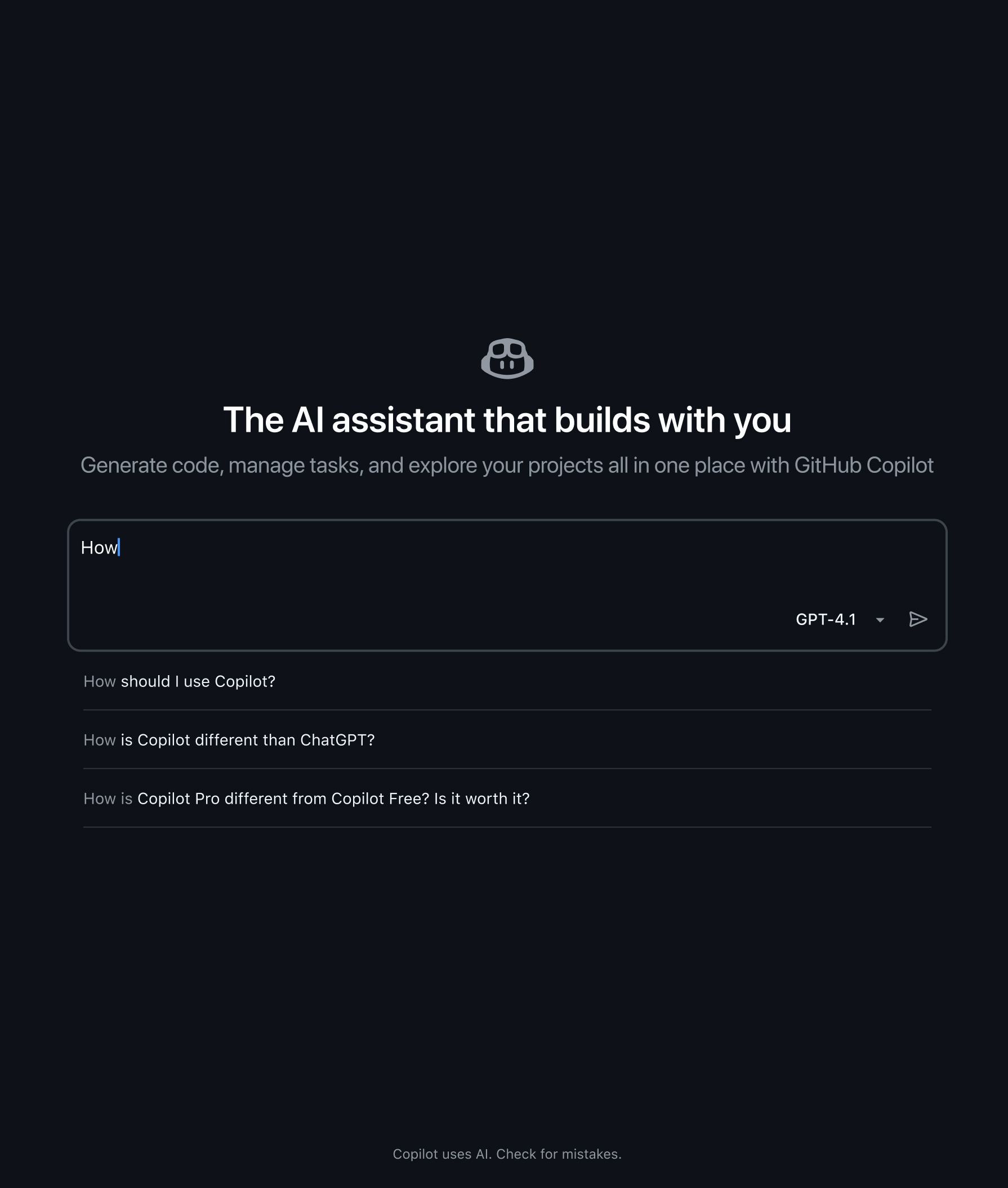
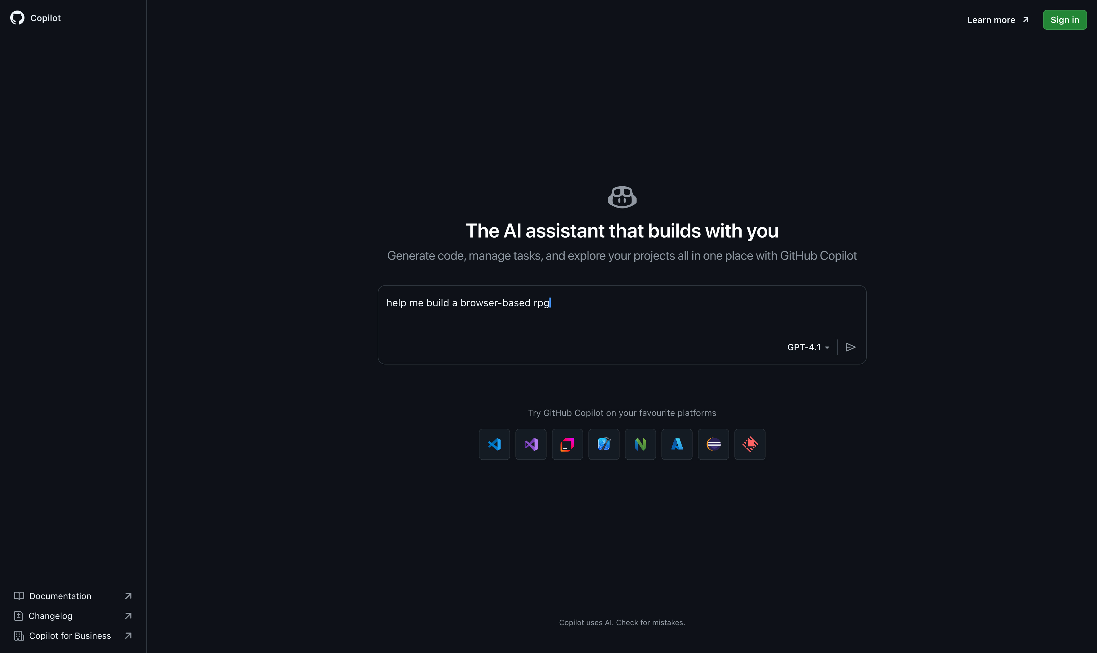
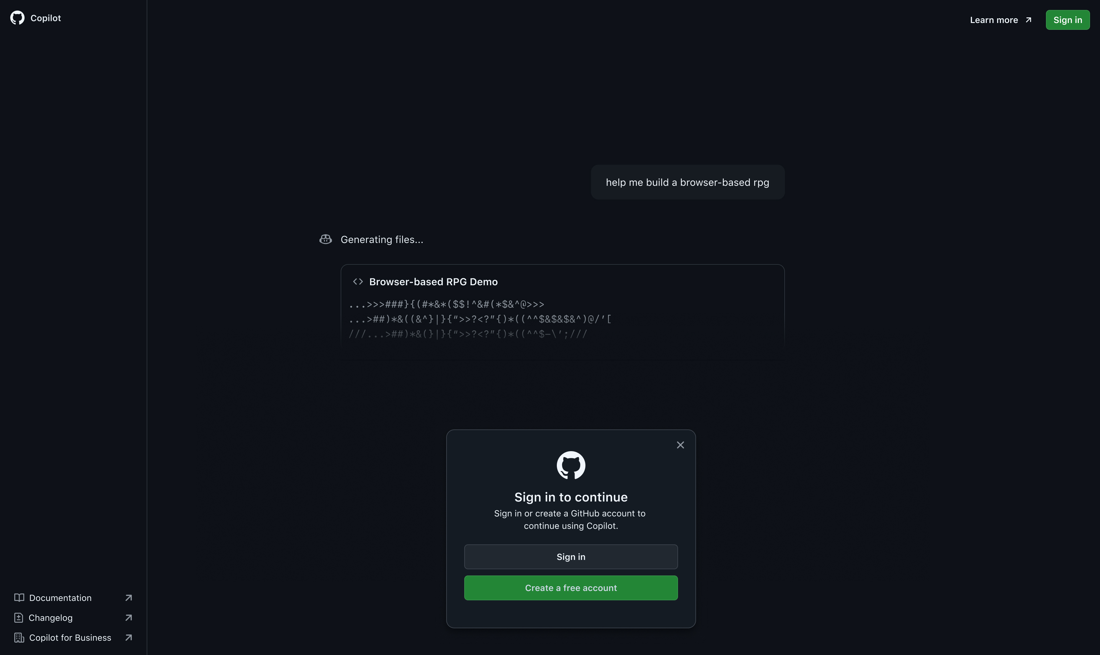
GitHub Copilot was rapidly gaining adoption, but we faced two major challenges. Users could only experience its value after completing a long and leaky checkout flow, and once inside, they often missed important product updates because of the pace of releases. This meant excitement was high at sign-up, but momentum stalled before activation and ongoing adoption. Our team set out to redesign the logged-out experience to let developers preview Copilot upfront, reduce checkout friction, and build a reusable system of in-product nudges to keep users engaged as the product evolved.
My role
Define UX strategy
Creative brief and ongoing direction
Define team topology
Define success metrics
Project goals
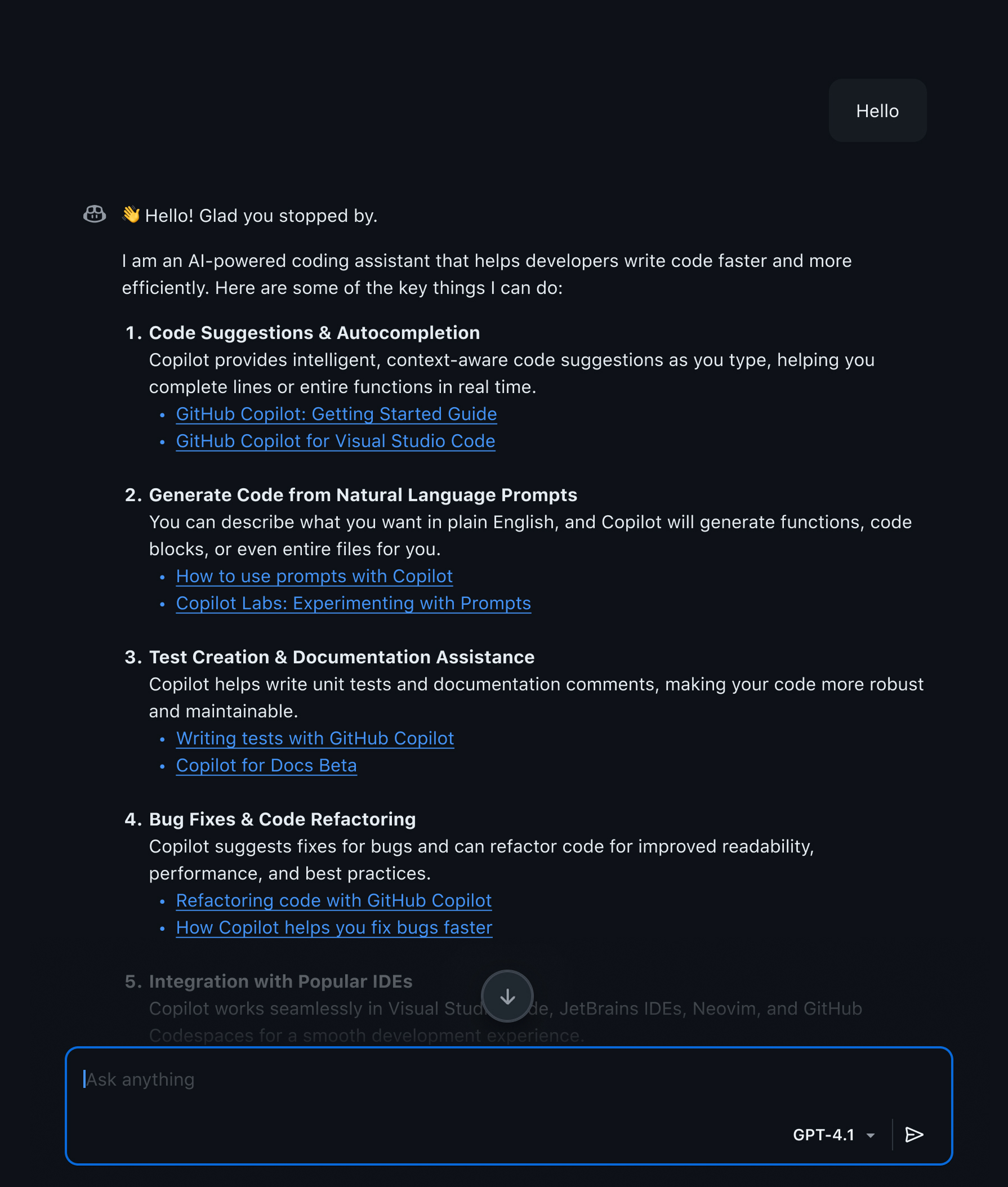
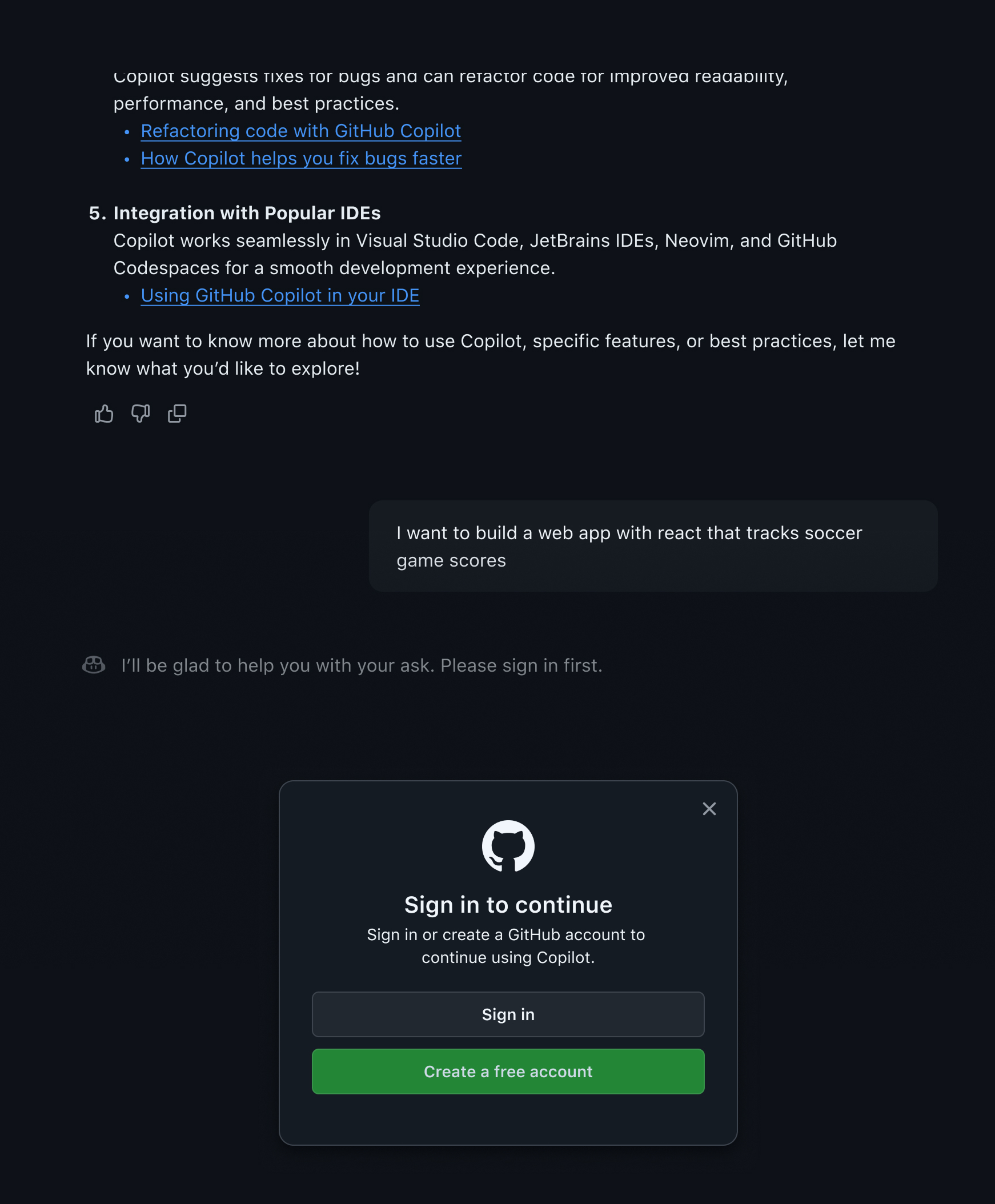
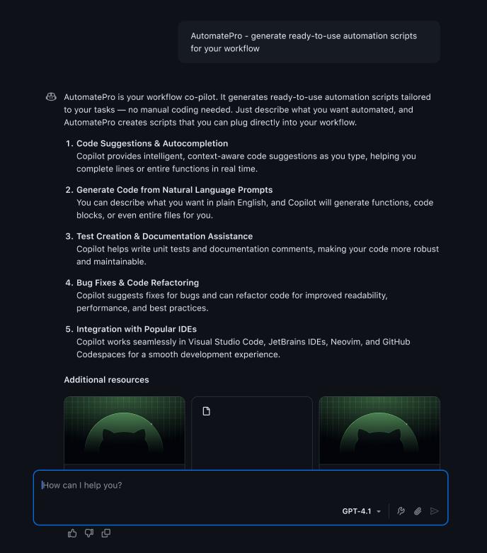
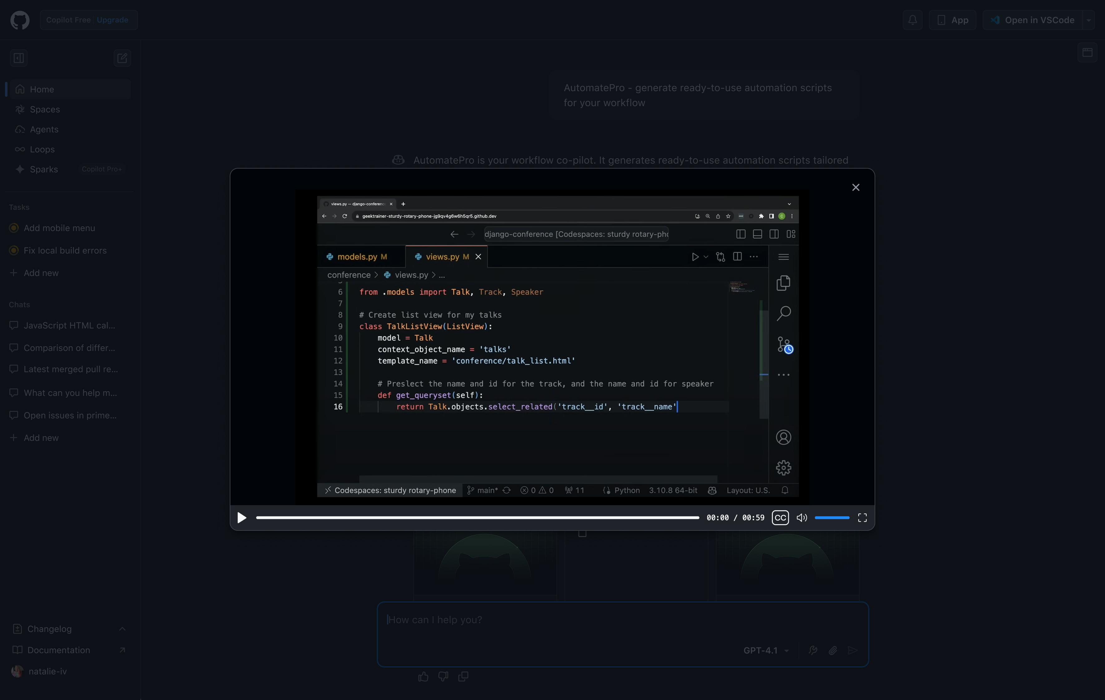
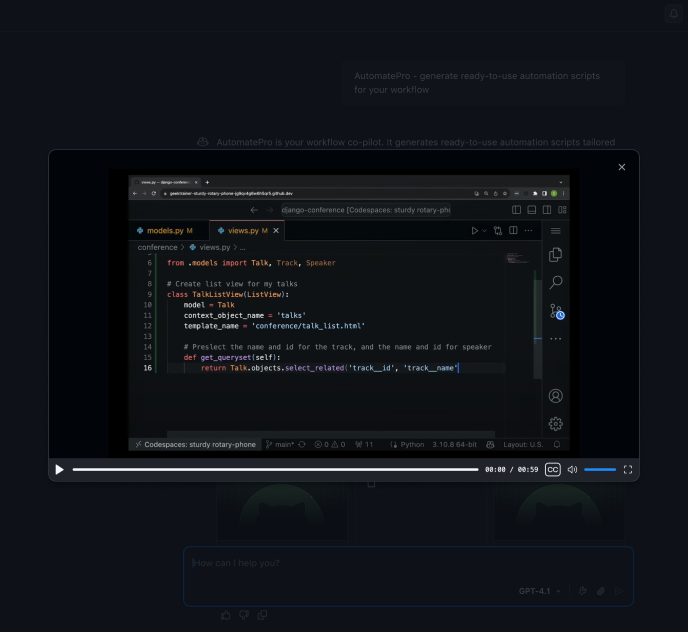
Redesigned logged-out chat to preview Copilots value upfront
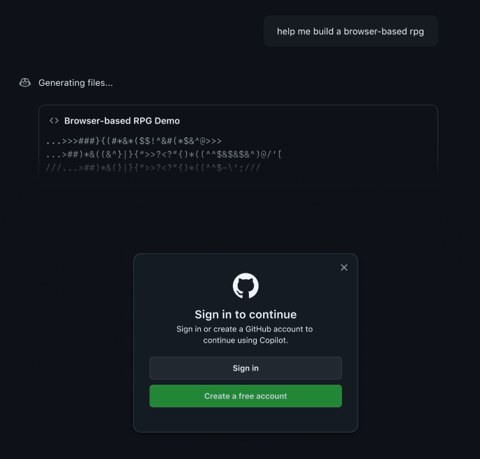
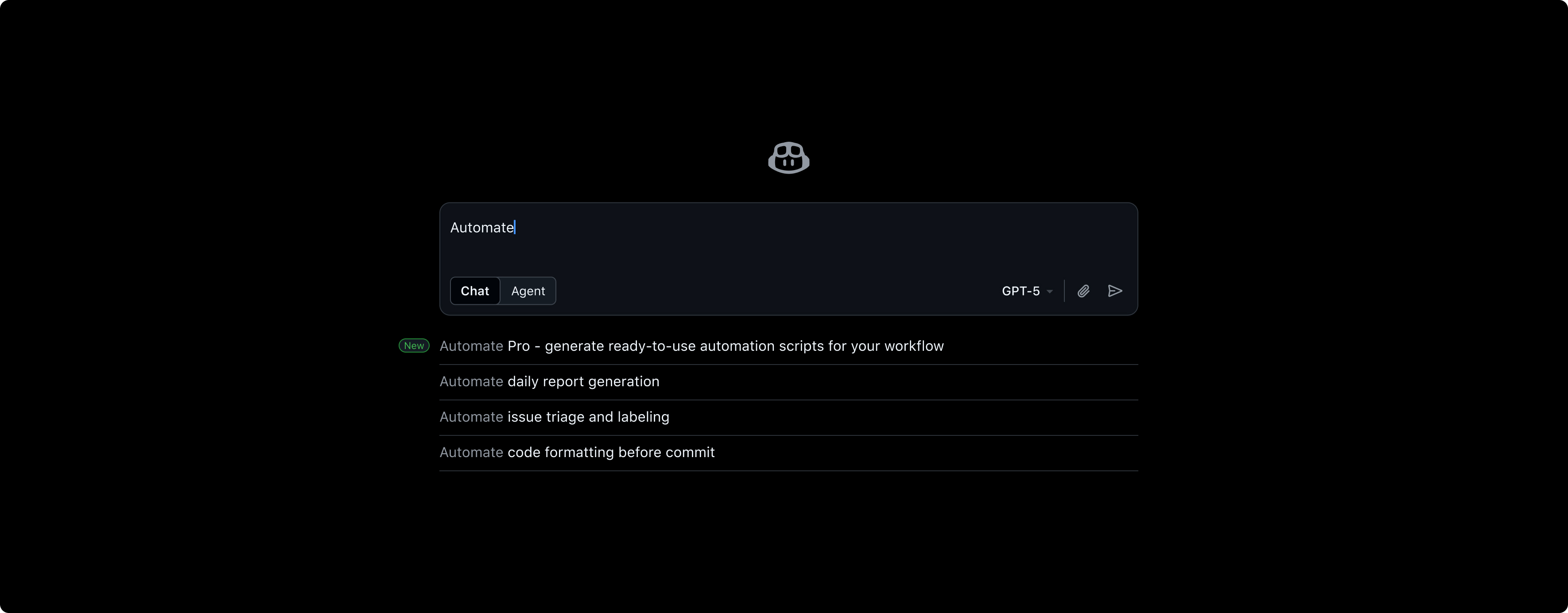
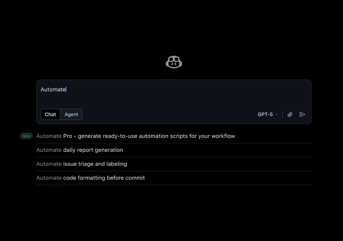
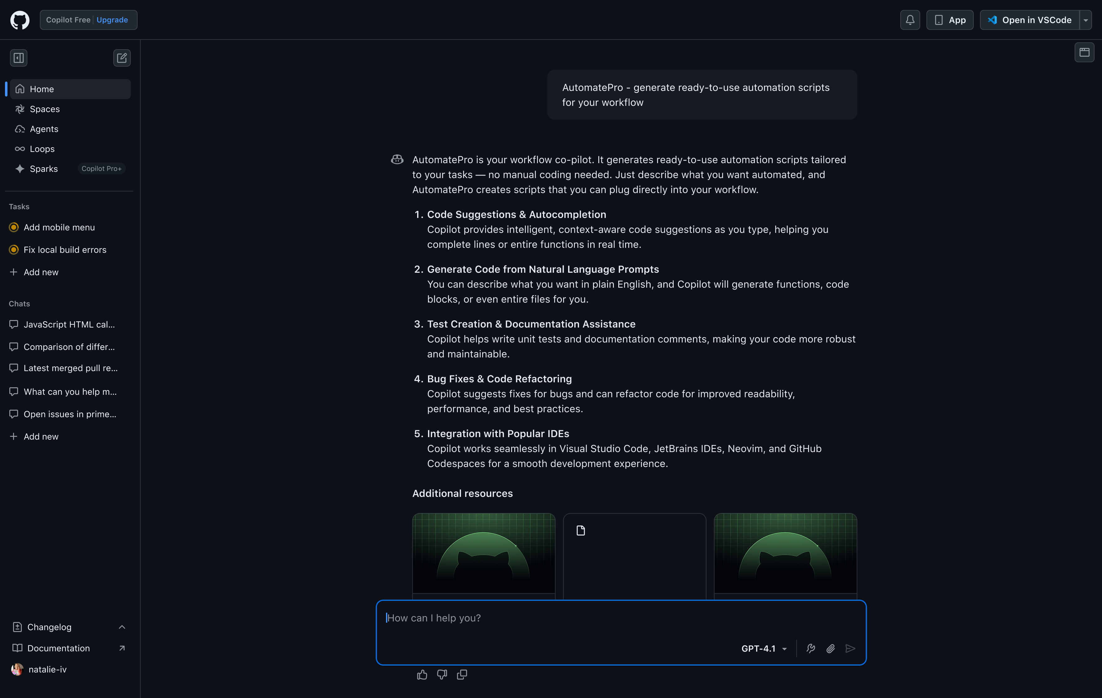
Designed a chat preview with pre-canned responses so users could try Copilot before committing. This gave immediate value and lowered the barrier to engagement.
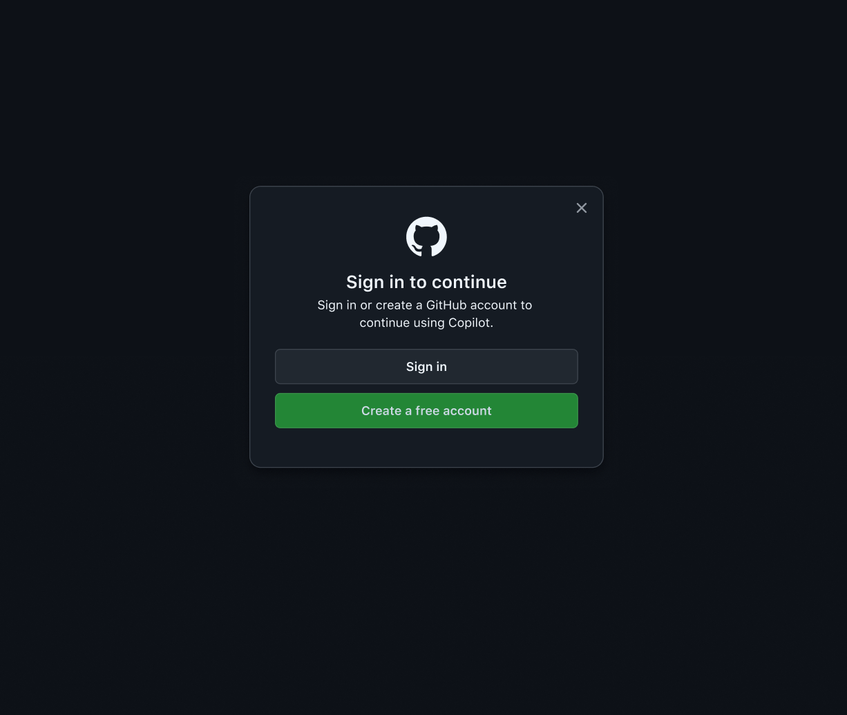
Activated a team to reduce friction in sign-up experience
Partnered with PLG teams to introduce social sign-on, reducing friction and improving completion rates.
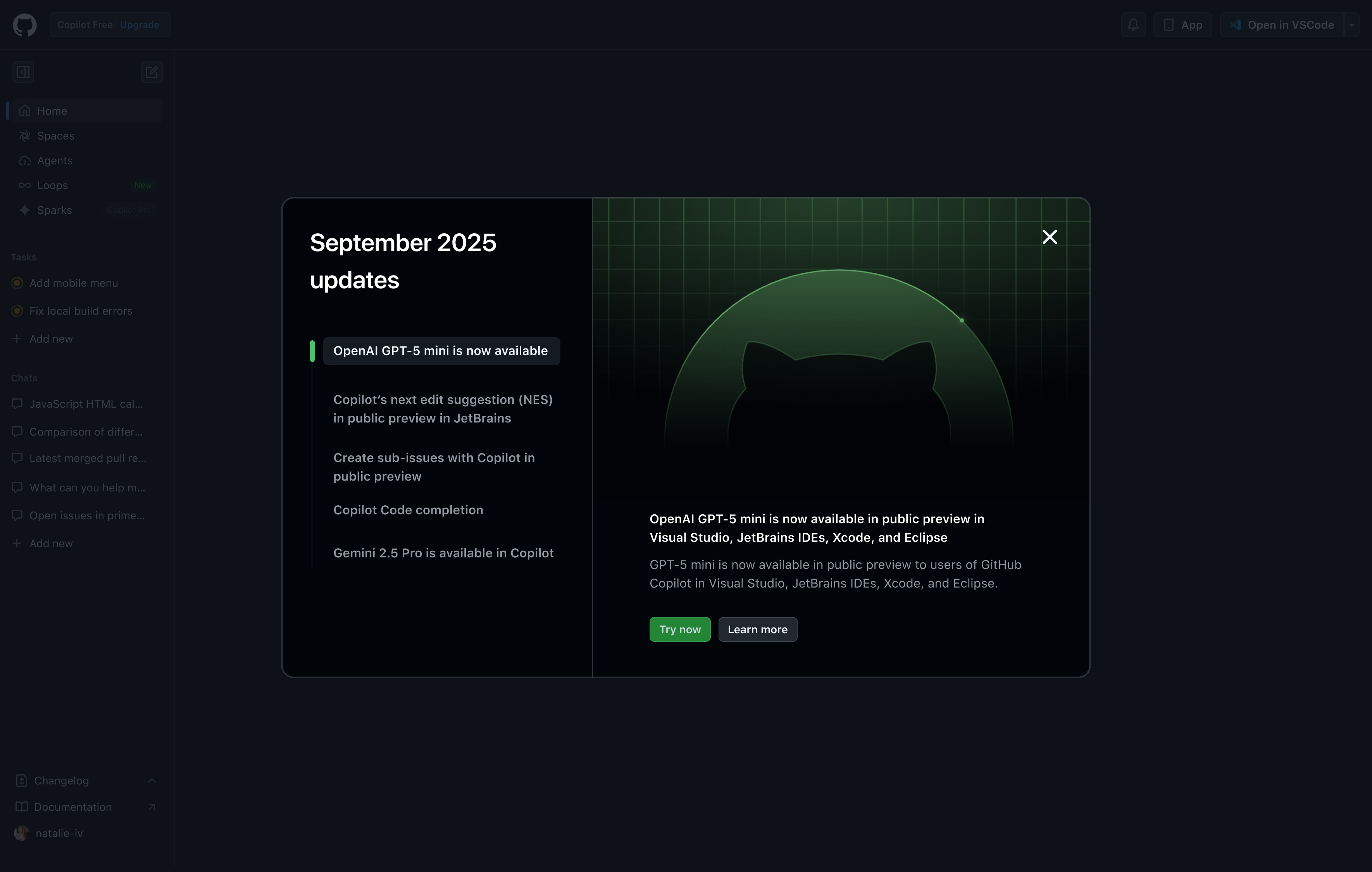
Experimented with in-product nudges to guide users to adoption
Collaborated with product teams to build a system of reusable nudges that could adapt to different tiers of releases (minor updates → major features). Ensured changes were clearly communicated and discoverable within the product.
Before...
First-time users lacked context and value clarity before committing. But providing free responses was too costly and we wanted to avoid usage abuse.Nearly 67% of visitors proceeded to log in or sign up. But there was a challenge for new users. Only 148 of the 34k people who signed up in the first 30 days made it through the sign-up flow. This presented a clear sign that friction was keeping people from even reaching their first real interaction. We introduced social sign-in to make sign-up even shorter, benefiting all net new users.
AfterUsing predictive searches, IDE onramps, and pre-canned responses, we gave logged-out users a taste of engagement to help incentivize sign-up.
Feel the brandWe wanted Copilot to be expressive. So we partnered with our product design team to define expressive principles and micro-interactions when engaging with Copilot.
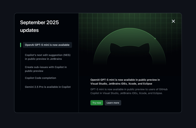
Thoughtful experimentsLogged-in users needed a way to stay informed of product releases as they became available. We created an agile team and program dedicated to testing product-led growth patterns.
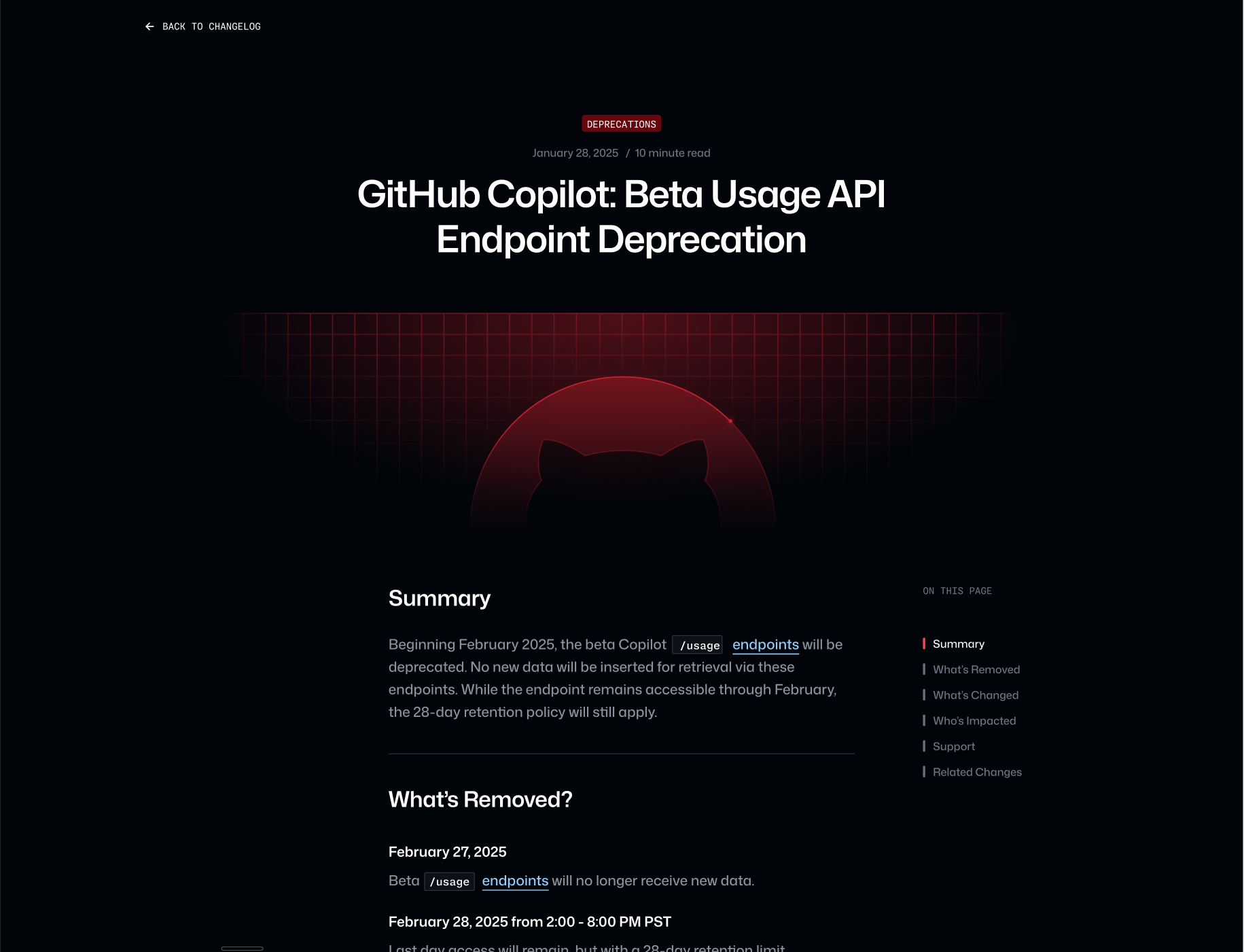
Map Content to UXBy connecting Copilot to our Blog, Docs, and Changelog content, we were able to create a process by which our Content team could directly influence and measure product adoption.
A balancing actAsk me about the video game principle that inspired this design brief, the thousands of ideas we didn't ship and most importantly, why.